

Mobile App Mockup: Test Your App Before Writing a Line of Code

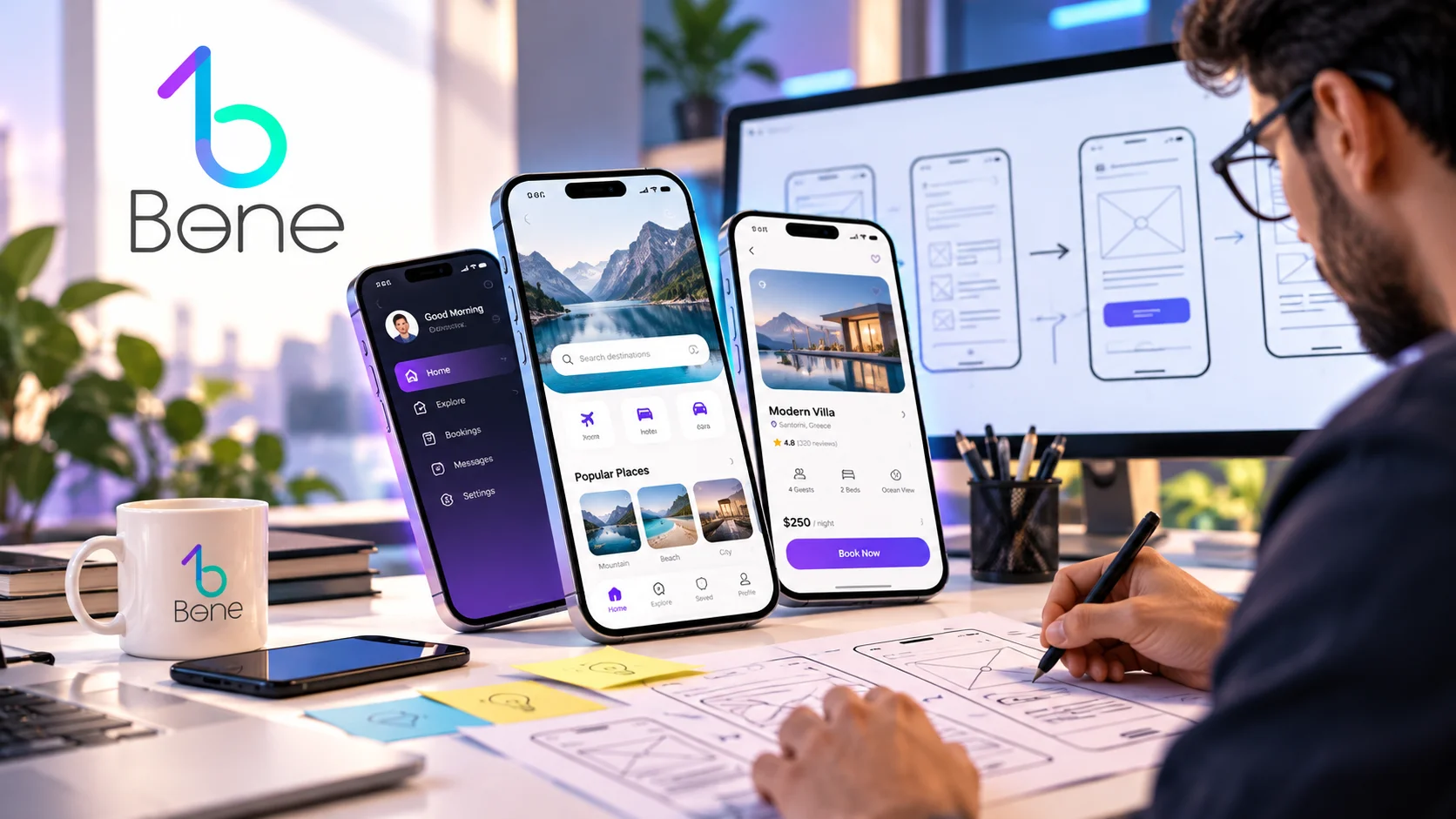
What if you could test your app before writing a single line of code? Before developers start building, before you spend money on development, and before real users discover that something is confusing, you can put the idea in front of them. Not the real app. The mobile app mockup. A well-planned design mobile app mockup can show how users will move through the product, where they may hesitate, what they may misunderstand, and which parts of the experience need to change. That makes a mockup much more than a pretty presentation. It becomes an early test of the product itself.
Why a Mobile App Mockup Is More Than a Pretty Picture
A mobile app mockup is a visual representation of an application interface. It can show screens, layouts, buttons, colors, images, menus, forms, and other elements before the application is fully developed.
But there is an important difference between showing what an app looks like and testing how an app works.
A simple visual can answer: “Does this screen look good?”
A useful mockup should answer harder questions:
- Does the user understand this screen?
- Does the user know what to do next?
- Is the most important action easy to find?
- Does the user understand the relationship between these screens?
That is why a good design mobile app mockup should be treated as an early product-planning tool.
Imagine a food delivery application. The designer creates a beautiful home screen with restaurants, categories, promotions, and a search icon. It looks impressive.
Then someone who has never seen the project uses the mockup and asks: “Where do I choose the delivery location?”
That single question can reveal a problem that would have been much more expensive to discover after development.
Your mobile app mockup is a Conversation With Your Future User
One of the most useful ways to use a mobile app mockup is to put it in front of someone who was not involved in creating it.
Do not explain everything.
Instead, ask simple questions:
- “What do you think this app does?”
- “Where would you click first?”
- “What do you think this button will do?”
- “What would you expect to happen next?”
- “Where would you go to find this product?”
These questions are valuable because designers and business owners already know how the application is supposed to work. That knowledge can hide problems.
The user does not have that advantage. If five people look at the same screen and three of them choose different actions, the problem may not be the users. The interface may simply be unclear.
This makes the mobile app mockup a practical communication tool between the business owner, designer, developer, and future customer. Instead of discussing an idea abstractly, everyone can look at the same screen and talk about something concrete.
The 5-Second Test for a Design Mobile App Mockup
A simple test can reveal a surprising amount of information. Show someone one screen for a few seconds and then ask: “What do you think this screen allows you to do?”
You are not testing their memory. You are testing whether the visual hierarchy communicates the purpose of the screen quickly.
For example, imagine an e-commerce app where the most important action is buying a product.
The screen contains:
- Product image
- Product name
- Rating
- Price
- Description
- Reviews
- Related products
- A small “Buy Now” button
Everything may look attractive, but the main action is visually weak.
- A user may start reading the description instead of moving toward purchase.
- A design mobile app mockup gives the team a chance to notice this before developers build the complete interface.
The test does not need expensive equipment. A simple prototype shown on a phone can be enough.
From One Screen to a Complete Mobile App Mockup Journey
A single screen cannot tell the whole product story.
The real question is what happens when the user moves from one screen to another.
E-Commerce User Journey
- Open App
- Sign Up
- Home
- Search
- Product
- Add to Cart
- Cart
- Payment
- Confirmation
Booking Application Journey
- Open App
- Choose Service
- Select Date
- Select Time
- Enter Details
- Payment
- Booking Confirmation
A mobile app mockup becomes much more useful when these screens are connected into a realistic user flow.
This is where teams can discover problems that are invisible when screens are viewed separately.
For example:
- The home screen may have a clear search button.
- The product screen may have a clear purchase button.
- The cart may look perfect.
- But after payment, there may be no obvious confirmation.
The user might ask: “Did my order actually go through?”
That is not a visual problem on one screen. It is a product-flow problem.
The Broken Button Test for a Design Mobile App Mockup
Here is a simple scenario.
Imagine that a user wants to buy a product.
The planned flow is:
- Home
- Product
- Add to Cart
- Cart
- Payment
Now look at every step and ask: What does the user expect to happen after this action?
Suppose the user presses “Add to Cart.”
Does the interface:
- Show confirmation?
- Change the cart count?
- Keep the user on the product page?
- Display a message?
- Allow the user to continue shopping?
- Make the cart easy to open?
A design mobile app mockup can reveal these small gaps before they become development issues.
The same test can be used for:
- Login
- Registration
- Booking
- Subscriptions
- Payments
- File uploads
- Other important actions
The goal is not to make every interaction complicated. Quite the opposite.
The goal is to make the expected action obvious.
The Cost of Changing a Mobile App Mockup vs. a Developed App
One of the biggest advantages of using a mobile app mockup early is flexibility.
At the mockup stage:
- Changing a button is easy.
- Changing the order of two screens is manageable.
- Removing an unnecessary step is simple.
- Changing the registration process does not require developers to rewrite working code.
After development begins, the situation changes.
A change may affect:
- UI design
- Front-end development
- Back-end logic
- Database structure
- API connections
- Testing
- Quality assurance
- Documentation
- App Store preparation
This does not mean changes should never happen during development. Real projects always evolve.
The point is that early feedback gives the team more freedom to change direction. A useful way to think about it is: A mockup permits you to change your mind while change is still cheap.
That is one of the strongest reasons to use a mobile app mockup before serious development begins.
How to Create a Design Mobile App Mockup That Actually Tests the Product
A good design mobile app mockup should be built around the product goal, not only around visual style.
Start with the user.
- Ask: Who will use this application?
- Then ask: What does this person want to accomplish?
- Next: What could stop them from completing that task?
Only after these questions should the interface be designed.
A Practical Mockup Process
- Define the main user.
- Identify the main user goals.
- List the most important app features.
- Create the main user flows.
- Organize the information.
- Sketch the core screens.
- Build the visual design.
- Connect the screens into a prototype.
- Test the flow with real people.
- Improve the weak points before development.
This process helps the design mobile app mockup become a working model of the product rather than a collection of attractive screens.
User Flow Matters More Than Individual Screens in a Mobile App Mockup
A common mistake is focusing too much on individual screens.
- A designer may spend hours making the home screen beautiful while the overall user journey remains confusing.
- Users do not experience an app as isolated screenshots.
They experience a sequence.
They:
- Tap
- Wait
- Make decisions
- Go backward
- Search
- Make mistakes
- Return to previous pages
A strong mobile app mockup should consider these behaviors.
For example:
| User Situation | Question to Test |
|---|---|
| User opens a product from search | Can they easily return to search results? |
| User adds an item to the cart | Can they continue shopping? |
| User closes the app during checkout | What happens when they return? |
| User makes a mistake | Can they easily correct it? |
These questions turn the mockup into a realistic product simulation.
Information Hierarchy in a Design Mobile App Mockup
Not every element on a screen has the same importance. The user should be able to recognize the most important information first.
This is called visual hierarchy.
Product Page Hierarchy
- Product
- Price
- Main Benefit
- Selection Options
- Purchase Action
- Additional Information
Service Booking Hierarchy
- Service
- Availability
- Date
- Time
- Customer Information
- Confirmation
A design mobile app mockup should make this order visually understandable. Size, spacing, contrast, position, typography, and grouping can all influence what the user notices first. If everything is large and visually strong, nothing feels important.
Good design often involves knowing what to reduce rather than what to add.
Navigation and the Mobile App Mockup
Navigation can make or break an application. Users need to understand where they are and where they can go.
Common navigation patterns include:
- Bottom navigation
- Side menus
- Tabs
- Search
- Back navigation
- Category navigation
- Dashboard navigation
The correct option depends on the application. For example, a shopping app may benefit from persistent access to:
- Home
- Categories
- Cart
- Account
A professional business application may need a completely different structure. A mobile app mockup allows the team to compare navigation options before development. This is especially useful when an application contains many features.
Adding more menu items does not necessarily make an app easier to use. Sometimes it simply makes the interface harder to understand.
Content Is Part of a Design Mobile App Mockup
Designers sometimes use placeholder text that can be useful during very early wireframing, but relying on it for final design decisions can create problems.
Real content has real length.
For example:
- A real product name may be longer than the placeholder.
- A real notification may need two lines.
- A real Arabic translation may take more space than the English version.
- A real error message may be much longer than expected.
For this reason, a realistic mobile app mockup should use representative content whenever possible.
The content itself affects the layout.
If the app will be content-heavy, the team should think about content structure early. Working with professional content creation companies can also help when the application needs large amounts of structured content.
Responsive Thinking Inside a Mobile App Mockup
Mobile applications still need to work across different screen sizes. A screen that looks perfect on one phone may feel cramped on another.
A good design mobile app mockup should consider:
- Different screen dimensions
- Safe areas
- Text scaling
- Long product names
- Different image ratios
- Touch targets
- Keyboard behavior
- Landscape situations when relevant
This is especially important for applications that contain forms.
A form that looks clean on a large screen can become frustrating when the keyboard covers part of the interface. The mockup should anticipate these situations before development.
Accessibility Should Be Considered in a Mobile App Mockup
Accessibility is not an extra feature that can always be added later. Color contrast, readable text, clear labels, button size, error messages, and logical navigation can make an application easier for everyone.
For example, if a button is identified only by color, a user with color-vision limitations may have difficulty understanding it. If an error message only says “Invalid input,” the user may not know what needs to be fixed.
A thoughtful mobile app mockup can identify these issues before they become part of the product.
Good accessibility also tends to improve general usability.
Brand Identity Inside a Design Mobile App Mockup
A mobile application should feel connected to the company behind it. Colors, typography, icons, photography, spacing, and visual style should support the brand.
However, branding should not overpower usability. A company may have a strong visual identity, but that does not mean every screen needs large logos or decorative elements.
The best design mobile app mockup finds a balance between brand recognition and functional clarity. A user should know that the application belongs to the company without being forced to look at branding elements at every step.
Testing a Mobile App Mockup With Real Users
You do not need hundreds of users to find early UX problems. A small group can reveal obvious confusion.
Choose people who resemble the target audience, or give them a task instead of explaining the interface.
For example: “Find a laptop under a certain price and add it to your cart.”
Do not tell them where the search button is.
- Watch what they do.
- Look for hesitation.
- Notice where they tap.
- Listen to the questions they ask.
- Do not immediately help them.
The goal is to discover where the interface fails to communicate. This makes the mobile app mockup a research tool as well as a design tool.
What should you measure in a design mobile app mockup test?
You can collect simple observations.
| Test area | Question |
|---|---|
| Understanding | Does the user know what the screen is for? |
| Navigation | Can the user find the next step? |
| CTA | Is the main action easy to identify? |
| Content | Can the user understand the information? |
| Flow | Can the user complete the task without help? |
| Errors | Does the interface explain mistakes clearly? |
| Confidence | Does the user understand what happens next? |
The purpose is not to create a complicated research report. It is to identify problems while they are still easy to fix.
Mobile App Mockup Versus Wireframe: What Is the Difference?
A wireframe usually focuses on structure.
It may show where the navigation, content, images, and buttons will appear without detailed visual styling.
A mobile app mockup is usually more visually developed. It can show:
- Colors
- Typography
- Images
- Icons
- Spacing
- Brand elements
A prototype can then connect these screens to simulate interactions.
The three can work together:
- Wireframe
- Mockup
- Prototype
The exact workflow depends on the project, but separating these stages can make feedback easier.
It is much easier to solve a structural problem before spending significant time polishing visual details.
Design Mobile App Mockup and the Development Team
A clear mockup gives developers more than visual inspiration.
It provides a shared reference for the design and development teams.
Developers can understand:
- Screen states
- Navigation
- Components
- Expected interactions
- Content placement
- Error states
- Empty states
- Loading states
- Form behavior
This can reduce ambiguity during development. For larger applications, the design should also include states that people often forget.
Important States to Consider
| Situation | What the mockup should clarify |
|---|---|
| No data | What does the user see? |
| Internet connection fails | How is the problem communicated? |
| Incorrect information | What error message appears? |
| Payment fails | What happens next? |
| Data is loading | What does the user see while waiting? |
A mature design mobile app mockup considers these situations before the application is coded.
From mobile app mockup to real application development
Once the major UX problems have been addressed, development becomes more predictable. The next step is translating the approved experience into a functional product.
This may involve mobile development, back-end systems, APIs, databases, authentication, payment systems, analytics, notifications, and testing.
A company looking for professional development can work with a specialized mobile app development company Egypt when the project requires a complete development process.
The important point is that development should not be used as the first place to discover whether the product idea makes sense. The mobile app mockup should help answer many of those questions earlier.
How a mobile app mockup supports website and app ecosystems
Some businesses need both a website and a mobile application.
- The two platforms do not have to look identical, but they should feel connected.
- The brand language should be consistent.
Information architecture should make sense. Important customer actions should be recognizable across platforms.
For businesses building both systems, professional website design and development can be combined with app planning so the website and application support the same digital strategy.
A good design mobile app mockup can help define how the app fits into this larger ecosystem before development begins.
Why performance thinking belongs in a mobile app mockup
Performance is usually associated with development, but design decisions can influence it.
Large images, unnecessary animations, heavy media, complex screens, and excessive third-party components can create technical challenges.
The mockup stage is a good time to ask:
- Does this animation add value?
- Does this image need to be this large?
- Does the user need this element?
- Can this screen communicate the same idea more simply?
A simpler interface can sometimes be easier to build, easier to maintain, and easier to use.
The same principle applies to websites. For WordPress projects connected to an app or digital ecosystem, resources about the best WordPress speed optimization plugins can be useful when improving the performance of the website side of the project.
The Role of Feedback in Improving a Design Mobile App Mockup
Feedback should not simply mean asking: “Do you like this design?”
That question often produces weak or subjective answers.
Instead, ask specific questions that reveal how users understand and interact with the interface:
- “What would you click first?”
- “What do you think this icon means?”
- “Where would you go to change your order?”
- “What do you expect after pressing this button?”
These questions generate more useful information about the user experience.
Business Feedback vs. User Feedback
Business owners can also review the mockup from a different perspective:
| Question | What it helps evaluate |
|---|---|
| Does the screen support the business goal? | Whether the interface serves the intended business purpose. |
| Does the application communicate the right value? | Whether users can understand the product or service. |
| Is an important service hidden? | Whether key business offerings are easy to find. |
| Is the customer being asked for too much information? | Whether unnecessary friction exists in the user journey. |
Combining business feedback with user feedback can significantly improve a mobile app mockup.
What makes a mobile app mockup ready for development?
A mockup is not ready simply because the screens look finished.
Before development, check whether the team has answers to these questions:
- Are the main user journeys mapped?
- Are the important screens designed?
- Are navigation decisions clear?
- Are button actions defined?
- Are empty states considered?
- Are error states considered?
- Are loading states considered?
- Is the content realistic?
- Has the target audience tested the main flows?
- Have major UX problems been fixed?
- Does the business agree on the product scope?
If the answer is yes, development can start with much greater clarity.
Common Mistakes When Creating a Design Mobile App Mockup
Several mistakes appear repeatedly in app projects.
Designing Before Understanding the User
A beautiful interface cannot compensate for a product that does not understand its audience.
Showing Only the Happy Path
The application should also consider:
- Errors.
- Empty screens.
- Failed payments.
- Missing information.
- Other situations that can interrupt the normal user journey.
Testing With People Who Already Know the Product
People who helped create the product may understand the interface because they already know how it works. This can make it harder to identify usability problems that a new user would experience.
Using Unrealistic Content
Placeholder text can hide real layout problems. Using realistic content in the mobile app mockup provides a better representation of how the final interface may work.
Adding Features Because They Look Impressive
Every additional feature can introduce design, development, testing, and maintenance requirements.
Treating the Mockup as a Final Decoration
The mockup should help the team make product decisions, not simply impress stakeholders.
Avoiding these mistakes makes the mobile app mockup much more useful throughout the project.
The Real Value of a Mobile App Mockup for Business Owners
For a business owner, one of the biggest benefits may be visibility.
Development can sometimes feel like a black box. Money is being spent, developers are working, and the final product may still be weeks away.
A mobile app mockup makes the product visible early.
You can:
- See the screens.
- Discuss the flow.
- Identify missing features.
- Remove unnecessary steps.
- Compare alternative ideas.
- Make decisions before the cost of changing them becomes high.
This becomes especially valuable when several stakeholders are involved.
- Instead of saying: “I imagined the checkout differently.”
- Someone can point to the screen and say: “This step should come before payment.”
That creates a much more productive conversation because everyone can discuss the same visual representation of the product.
Don’t Ask “Does My Mobile App Mockup Look Good?”
There is nothing wrong with asking whether an app looks good, but it should not be the main question.
Ask something more important: “Can someone understand how to use it without me explaining it?”
- If the answer is yes, the mobile app mockup has already done something valuable.
- If the answer is no, you have discovered a problem before paying to build it.
That is the real strength of an early product model. A good design mobile app mockup gives the team a safe place to question assumptions, test ideas, remove unnecessary steps, and improve the user journey.
The application may not exist yet, but the experience can already be tested.
Frequently Asked Questions
What is a mobile app mockup?
A mobile app mockup is a visual representation of an application’s screens and interface before the application is fully developed. It can show layouts, colors, content, navigation, buttons, and other interface elements.
Why is a mobile app mockup important before development?
It allows businesses and designers to identify UX problems, unclear navigation, missing screens, and unnecessary steps before those problems become part of the developed application.
What is the difference between a mockup and a prototype?
A mockup mainly represents the visual design of the application. A prototype connects screens and can simulate interactions, allowing users and stakeholders to experience the planned flow.
How do I test a design mobile app mockup?
Give a person from the target audience a simple task and ask them to complete it without explaining where to click. Watch their behavior and note hesitation, mistakes, questions, and unexpected choices.
Can a mockup reduce development costs?
It can reduce the risk of expensive changes by identifying problems before development, testing, and launch. Changing a screen design is generally easier than changing a fully developed feature.
What should a mobile app mockup include?
It should include the important screens and user journeys, realistic content, navigation, key actions, and relevant states such as loading, empty, success, and error screens.
Should a mockup be tested on real users?
Yes. Even a small number of relevant users can reveal obvious usability problems that the project team may not notice because they already understand the application.
Does a design mobile app mockup need real content?
Whenever possible, yes. Realistic text, product names, prices, images, and messages make it easier to identify layout and usability problems.
Can the same mockup be used for Android and iOS?
The core user experience can often be shared, but platform-specific interface patterns and technical requirements should be considered during the design and development process.
When should a business create a mobile app mockup?
Ideally, it should be created after defining the product goals and primary user journeys but before significant development begins. This gives the team enough information to test the concept while keeping changes relatively easy.
At Be One, we look at digital products as complete experiences, combining app development, website solutions, SEO, GEO, and content strategy. If you have an app idea that exists only in your head, on paper, or in a rough concept, Be One can help turn that idea into a clear digital product plan and move it toward a professional, usable application.
Your app does not need to exist yet to start testing whether it works.


